FARBLOS STUDIO
- FARBLOS STUDIO
- FARBLOS STUDIO
- FARBLOS STUDIO
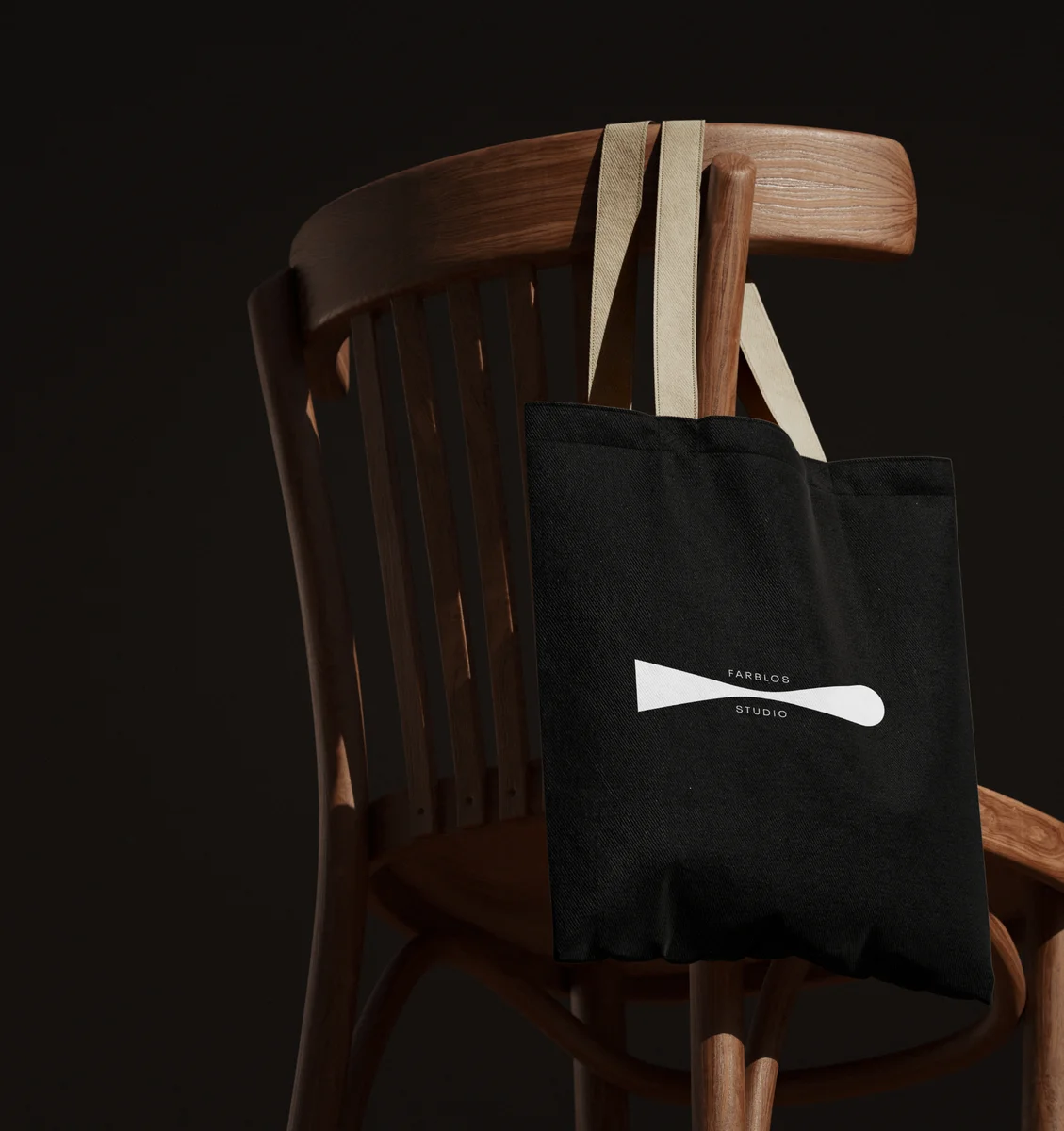
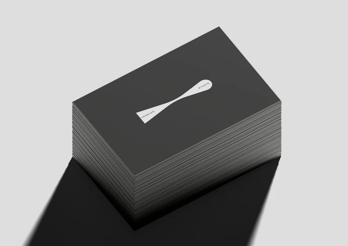
Farblos Studio is a design and making studio working across concepts, products,spaces and physical objects. The logo is based on a simple transformation: a raw form gradually becomes a refined one. It represents the studio's process of taking an initial idea, developing it through design and ultimately giving it a physical form.
IDEA → PROCESS → REFINEMENT → OBJECT
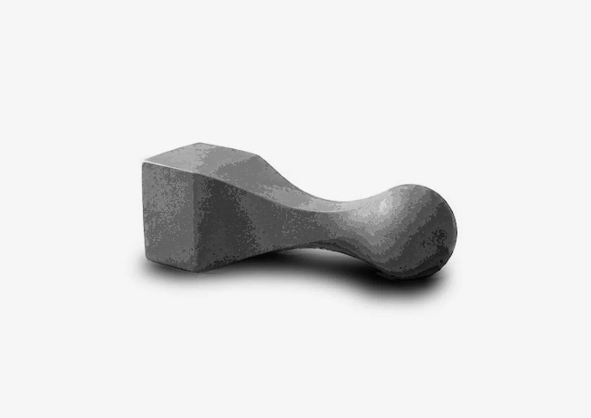
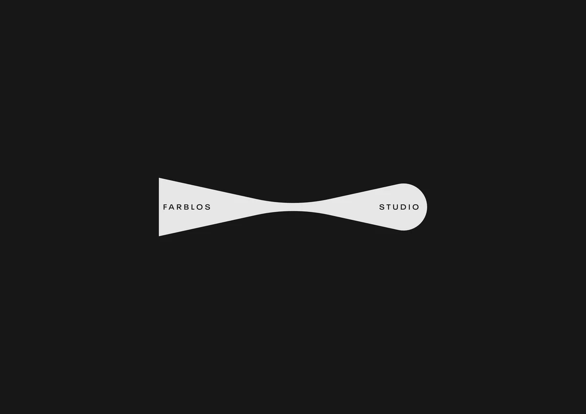
The starting point is the contrast between two basic geometric forms: the cube and the sphere. The cube represents something raw, solid and undefined. As it moves through the centre, its geometry is gradually reduced and refined, eventually becoming a smooth, rounded form. Rather than showing separate stages, the logo treats them as one continuous transformation. This reflects the way Farblos Studio approaches its work: ideas are not simply designed and finished, but shaped, tested and transformed a along the way.
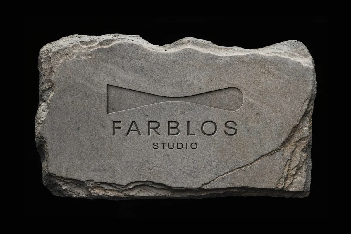
The logo is designed to work not only as a two-dimensional graphic, but also as a physical form. Its three-dimensional interpretation reinforces the character of Farblos Studio as a hands-on design and making practice. The same transformation can be explored through different materials and fabrication methods, allowing the identity itself to become an object. Design becomes form. Form becomes object
The final symbol distils this transformation into a single, continuous form.The result is a simple and recognisable mark that communicates transformation, refinement and making without being tied to a single type of project.
Details
Year
2026
Client
FARBLOS STUDIO
Category
VISUAL COMMUNICATION